Bad Data
Bad data is everywhere. Whether it comes from a bad source, formatted incorrectly, or the analysis is biased, people and organizations end up making bad decisions based on misleading data.
In this article I will talk about and give examples of:
- Signs you have bad data floating around your organization.
- Reasons why misleading data and analytics are produced and consumed by companies.
- How organizations can improve their data analytics and get better value out of it.
65% of executives don’t have a high level of trust analytics, and 25% either actively distrust or have very low trust in the data according to KPMG research. Every year we generate and capture more and more data, and our analysis methods increase in sophistication. Nonetheless, trust in the data is not growing. The distrust in numbers is only eclipsed by the distrust CEOs have for the marketing function, which tops at 80%.
Having spent years at the confluence of these two areas, Marketing Analytics, I can tell that executives are not wrong to be skeptical of the numbers. IT and analytics functions are certainly responsible for producing bad data, but some blame lies with the organization’s rewards and incentives structure.
Six Signs That You Have Bad Data
These are the typical symptoms of having bad data floating around the organization:
- All initiatives are performing splendidly, but sales and profits do not improve. This is very common in marketing analytics: We show campaigns being very effective at driving purchases from new and returning customers, yet the total sales don’t grow to the same degree.
- Different teams provide conflicting assessments of initiatives’ performance. It is possible to have explainable differences in the results, but then the numbers should point in the same direction. However, if business units always insist that their measurements are better than those of outsiders, it indicates a bad data problem.
- There are no standard ways to measure initiatives. Every program is evaluated differently, and approaches are not consistent. Business leaders often disagree with analysis methodologies, and there are always disputes on which measurement approach is better.
- Program assessment is an afterthought and is only questioned after the program has been implemented. Analytics is not involved in the planning stages of initiatives and the business does not know what and how they get measured.
- You often hear “this data is unreliable”, typically, when questioning unfavorable numbers or as a request to use a more familiar data source.
- Company-wide analytics initiatives fail to deliver promised results. It’s never quite clear whether the analysis never produced definitive recommendations or whether the recommendations were incorrect.
Why Your Data Is Not Trustworthy
There are many causes of bad analytics circulating in organizations, and we can roughly put them into these three buckets: source data, analysis, and leadership.
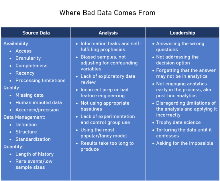
Bad Data Source
Bad data that originates in the source includes quality, availability, and the length of history. These are the typical examples of data source issues and how to deal with them:
- Missing metrics definitions and data origins documentation are extremely common in businesses of all sizes. I have seen two divisions of the same company use conflicting definitions of the same metric. In another case, a business unit changed its metric definition but did not adjust historical data. Don’t skip on documenting the data definitions and establishing clear metrics.
- Prioritize the data that needs to be of high quality. Having usable critical data is better than having usable ancillary data.
- Understand the types of queries analysts are running most against your data, and create the data structure to match those requests. This will not only help with processing time but will reduce inadvertent errors.
- Commit to a solution. It may take longer than you expected to get good data, but if you switch to a different solution in mid-process, you are likely to lose more time.
- Give access to the data across the organization, and give analysts the tools to query it. If your data is of poor quality, you will quickly get a long list of tickets. At this point, you can decide on the best quality improvement strategy.
- If you hear someone claiming that a data source is unreliable, ask where to get reliable data, and then pull the same metric from the presumably reliable source to compare. The results might surprise you.
- New companies, brands, or locations may not have a data history long enough for good analysis. Accept this limitation, and try to develop benchmarks based on reasonable assumptions about the business.
- IT systems take a certain time to process and update the data, so your inputs may not be current enough for your purposes. For example, dynamic pricing might not be an option if it takes hours to update the source database. Keep this in mind when you assess the feasibility of projects or design IT infrastructure.
- Human input data, whether customer comments or CSR codes, is prone to errors. You may be able to overcome it by using the data consistently and creating validation checks.
- Beware of data that does not like to play together. When I worked for a cable company, we could not reliably link an incoming call to a new account. There was a disconnect between the systems, with an additional bridge needed to join the data.
The good news is that, typically, data quality is where companies are willing to invest. With the cost of data storage and processing going down, most companies now have clean and correct source data.
Bad Data Quality Case Study
A large company hired an outside analytics vendor to assess its market penetration with Hispanic customers. The vendor concluded that the company had a very high penetration rate in certain markets, close to 100%.
The vendor defined a “Hispanic customer” as a person with a Spanish or Portuguese last name. They were able to analyze the current customers and find those of Hispanic origin easily. However, the vendor had very sparse non-customer name data. As a result, in some areas, they found no Hispanic non-customers, which drove the penetration to 100%.
This error was revealed at a client presentation when an executive thought the results looked too good to be true and started asking questions. Disproportionately more errors pass the eyeball check when the results appear to be good for the company. This is why a healthy skepticism of exceptionally rosy assessments is a great starting point for data validation.
Bad Analysis
These issues originate from the way the data is processed and analyzed. Analytical errors are more common than people think, but they don’t always result in a misleading outcome.
My recommendations on fixing typical analysis methodology issues.
- All analytics should start with exploratory and descriptive analytics, which helps understand distributions of variables and relationships among them.
- Feature engineering is a great tool that often makes or breaks analytics. Data transformation and aggregation are the two common types of feature engineering. Transformation: Should you analyze total sales amounts or their changes year over year? Aggregation: Should you group customers who made purchases 3 to 6 months ago or 3 to 12 months ago?
- Biases in analysis, from confounding variables to information leaks create serious latent issues. These issues are not obvious to the naked eye, but of all analysis problems, these are the most likely to produce a misleading result.
- Controlled experiments are a powerful way to create a baseline to measure the outcome against. These baselines help isolate the impact of your programs even if there are data issues or unexpected events, and all you need are representative groups.
- I have seen analytics projects fail because the only reason they were created was to showcase an application of a new and shiny method, like AI.
- Only use advanced methods when simple methods fail. Complicated methods are harder to develop and troubleshoot, and they tend to be used incorrectly. A simple method is harder to misinterpret and easier to validate.
Good Analysis Methodology Case Study
A leading US company ran an extensive direct mail program. The sales to customers who got the mail were measured against a representative hold-out group, which was not mailed. When a new direct mail vendor deployed a cleaning process, they found that the mail lists in different states had vastly different address quality. In some states only 2% of addresses were bad, and in others up to 15% were non-deliverable.
However, all of the historical results were still valid because both mail and control groups had the same percentage of bad addresses. The only thing that needed an adjustment based on the number of undeliverable addresses was the cost of mailing.
In this example, a solid experiment design and analysis approach delivered a reliable result even though the source data was bad in unexpected ways. This is not a rare case. I validated many projects with source data issues, and every time a well-chosen methodology needed only minor adjustments if any.
On the flip side, a biased analysis methodology turns analysis into a self-fulfilling prophecy, delivering a pre-determined result, no matter the reality.
Bad Data Leadership
Leadership issues are probably the most common and hardest to fix. Many business executives are used to making their decisions based on gut feeling and have no experience of incorporating data and analytics into their decision-making. With the data issues described above, it’s no wonder they lack confidence in numbers.
Here are some examples of poor analytics leadership:
- There are no right answers to the wrong questions. Spending some time to carefully decide “which questions are worth answering and which are not” is one of the most important tasks in analytics leadership.
- Business decisions should drive the way we ask the analytical question. If the question does not address available decision options, and the answer is bound to be non-prescriptive.
- Understanding the business is critical for delivering great analytical projects. Analysts often struggle with domain knowledge. If business leaders treat the analysis output as irrelevant, the analysts may need more exposure to the business.
- When measuring a program or a project, early engagement of analytics is the key to developing an effective measurement plan. It also helps establish a solid agreed-upon methodology, thus reducing the risk of misleading results.
- Trophy data science is a type of the earlier “fancy methods” fallacy, but with an added organizational incentive to use the most advanced method. This happens when companies are eager to apply the latest, most shiny hammer with little regard for not having any nails.
- Asking for the impossible happens when leaders don’t take time to understand what analytical tools can reasonably accomplish. Even the best image recognition model will fail to find things that are not on the image.
- As the saying goes, if you torture the data long enough, they will confess. This is the last and the most important source of bad analytics. It comes from lacking organizational incentives to report objective reality.
Bad Analytics Leadership Case Study
The Snapshot report was the holy grail of analytics. It was requested by the business, and it would show everything that happened during the month, new sales, customer attrition, upgrades, and downgrades. It would have everything.
The BI department analyzed the specs and decided they needed to restructure the data and create a special data warehouse to achieve the level of detail required by the Snapshot report.
Two years of work later, the Snapshot report was produced. Though it was cumbersome to run, it had it all. The business executives looked at it, said “OK, that looks good”, put it aside, and never looked at it again.
Months later, analysts from other departments figured out how to run consecutive Snapshot reports so they could see how the metrics changed month to month. The data structure had to be reworked once again, to make it easy to run the reports that made sense for the business.
One remedy to this common situation that I successfully used is the “pretend method”. Pretend that the analysis has already been done and ask the business requesting the numbers the following questions: “What if we calculated your metric, and it’s 20. Is it good? Is it bad? How would you know?”
This triggers a realization that knowing the number is not enough. It needs to be used in context to produce valuable insight. It also prompts a conversation about the use of the metric and why the business wants to look at it.
Conclusion
Bad data is abundant, and organizations need to pay attention. The origins of data errors run a gamut from poor source data to torturing the data to fit business agendas.
Fixing data issues is a long process, but it will pay for itself in better understanding of the business, improved trust among departments, and more confident decisions. In other words, it’s worth it.
If you would like to get clarity on the origins of your bad data, you need to have experienced eyes look into it. Much like detectives, independent analysts can conduct data investigations and not only tell you which data is better but provide recommendations on how to fix the process to deliver reliable data consistently.

by Tanya Zyabkina
Tanya Zyabkina has over 15 years of experience leading analytics functions for multiple Fortune 500 companies in the retail and telecom industries. Her experience spans from qualitative market research in the fashion industry to determining the impact of promotions on subscriber behavior at a cable provider.